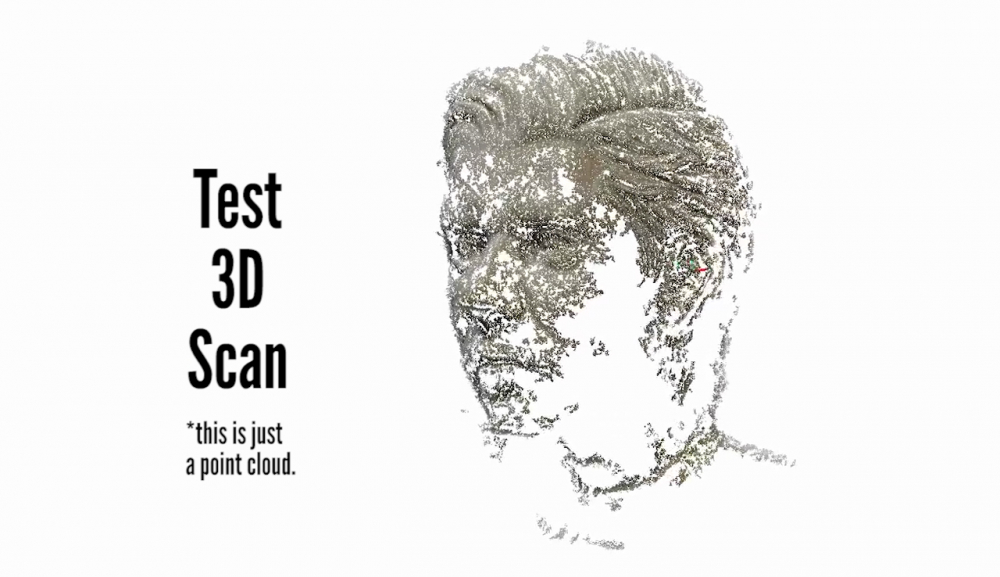
In this video I'll be showing you how you can turn almost any object into a 3D model with just your camera and some free software.
Now I'm not an expert at any of this. I've tried as best as possible to read through all the documentation, at least the parts I understand, and condense that into a video.
Also please note the cleanup process was aimed at getting it ready for sculpting. I know that people like to scan objects to then 3d print them, but I don't have a 3d printer, so you'll have to look somewhere else for the details on how to do that properly.
Lastly, I would love to share the project file so you can see what I tested but it's HUGE (15GB) and I'm not sharing the 3d model just yet because it's an original character of mine so I'm working on a generic version for practicing lighting the face, the first version is now available for patreons.
Intro
So there are free programs out there like Autodesk 123D Catch (which was a bit limited when I checked it out) and there are some open source programs like VisualSFM but I wanted something that was both open source, and therefore free (w/ no patent issues) AND allowed for commercial use, and the only program that seemed to satisfy that requirement was Regard3D. Also it's the only one of the open source programs that takes you from the photos to the finished model. Otherwise you might have needed 2-3 different programs as this blog post illustrates.
Regard 3D Pros:
- Open source
- All-In-One Solution
- Advanced options. (but also works well out of the box)
- Simple Nice UI.
- Branching (saves past parameters)
- File "Autosaves" Crashes only loose what was computing.
- Allows Exporting (of sparse and dense point clouds as well as models)
Cons:
Texture bug (solution). Has been fixed. - Resource intensive, but then most photogrammetry programs are.
The Pictures
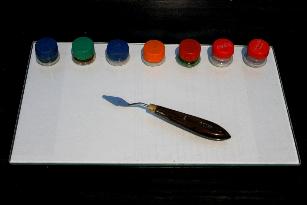
The ideal way would be to have the camera rotate around the object with plenty of soft lights. Alas, I could not do that, so my setup was more like two desk lamps which I diffused as much as possible with a piece of paper and a blank white background. I then rotated the object instead of the camera.
The moving highlights and shadows can cause some problems, but I was able to get a decent scan this way anyways.
Unless your object is made of glass (in which case you'll have to coat it in something so it's matte), and not too glossy it should work.
Texture
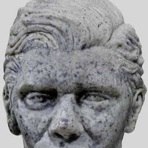
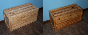
Even if the surface is matte though you need some texture else you won't get any matches. For this you can splatter some ink, or watercolors, or something (test the pigment will not stain first). This will help a lot if your object is a sculpt like mine with minimal texture. Without it the software has no good reference as to where anything is in space.
How many pictures to take?
More is always better, but there is also a point where this will just slow down your computer. I recommend 4 different height angles and about ~16 photos each round. In total I took about 74 photos for this not including the extras.
Also if possible your photos should all be with the same camera at the same focal length.
Regard 3D
Adding Images
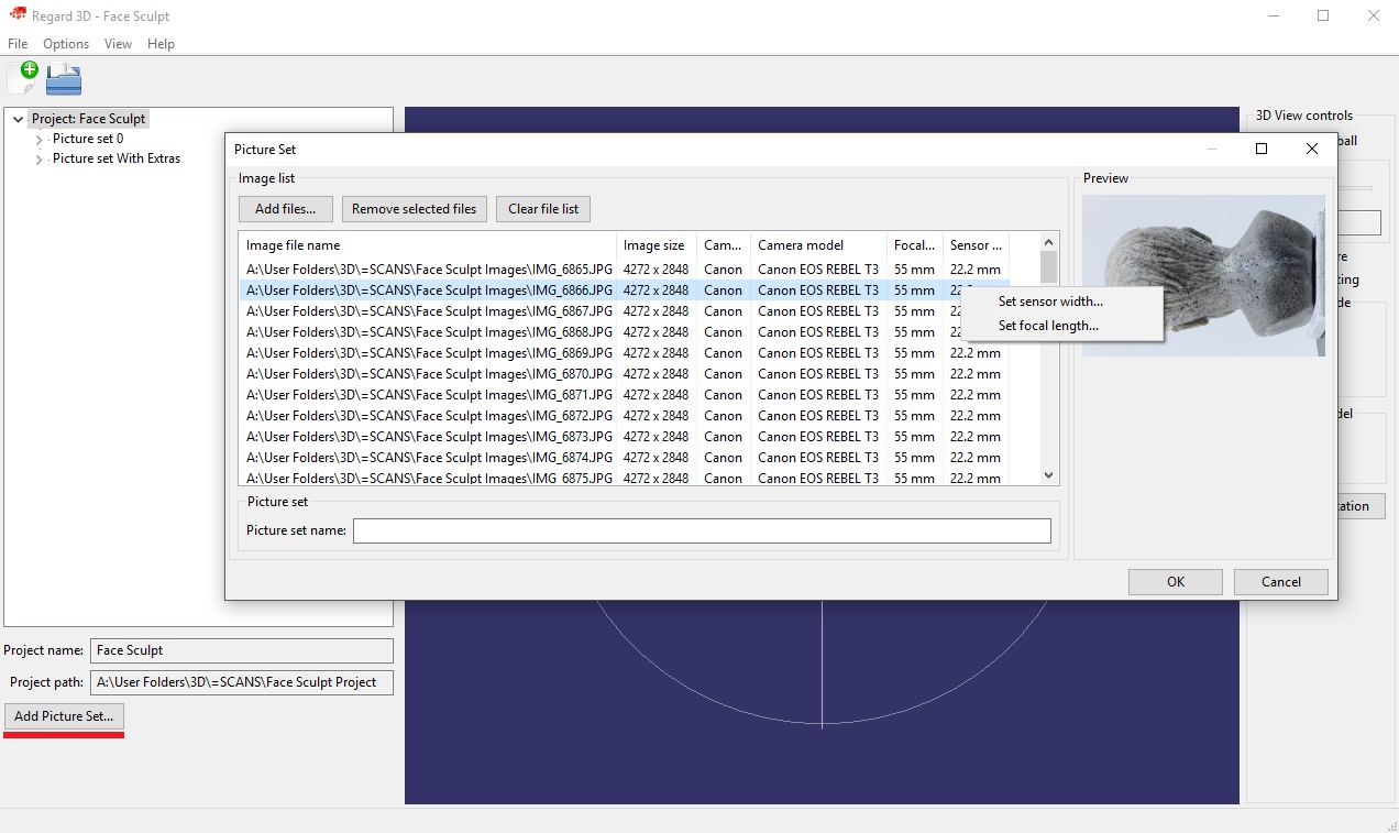
First create a project: File > New Project. Select where it's going to store the files (it can take up many GBs, mine was ~15GBs by the end of this with so many tries) and the name.
In the lower left you'll see a button that says Add Picture Set...
Here you can add all your image files. It might take a few seconds for them to load all the metadata. Make sure the camera model, focal length, and sensor size are set. If the sensor size is not set in the newest version you can now set it manually (right click) if the program could not find your camera model in it's database. Just google for your camera model and sensor size. If the focal length isn't set you can also set it manually but you'll have to know what focal length you used.
Then just name your picture set something and add all the images.
NOTE: Do not move the images after you've added them or you will get an error trying to open the project. This can be fixed by opening the .r3d file in the project folder with notepad or some other text editor and finding and replacing the incorrect paths, but be warned.
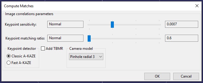
Computing Matches
Now the Regard3D documentation, link below, goes more in depth into some of the options. I'm not going to go over everything, just cover some of the stuff it doesn't cover or what I learned worked best for me from experience.
Here the default settings work pretty well. I found on my laptop (specs at the end) setting keypoint sensitivity too high would cause it to crash (EDIT: this no longer happens on my new better desktop). Setting the keypoint matching ratio to high though and the keypoint sensitivity to low improved some of my results without crashing.
This can take a while, up to an hour for me at least (EDIT: Takes me 5-15 min on my new computer!).
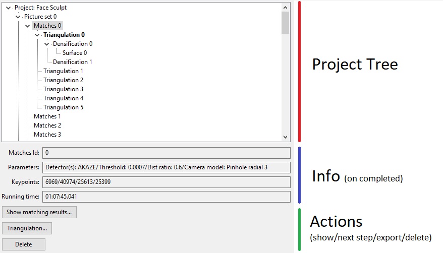
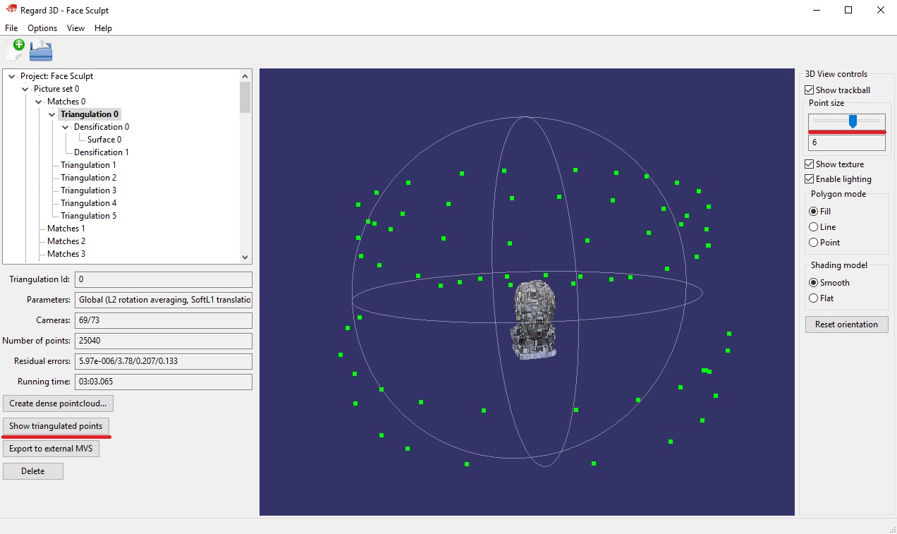
Tree Structure
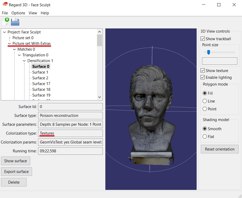
So at this point you'll notice the tree view in the sidebar has started branching out. Here's what a finished project looks like for example:
At any point you can go back and check the parameters you used, how much time it took, etc, and each level will give you different options depending on what stage you're on.
You can also export point clouds and models to other programs from here if that stage allows for it.
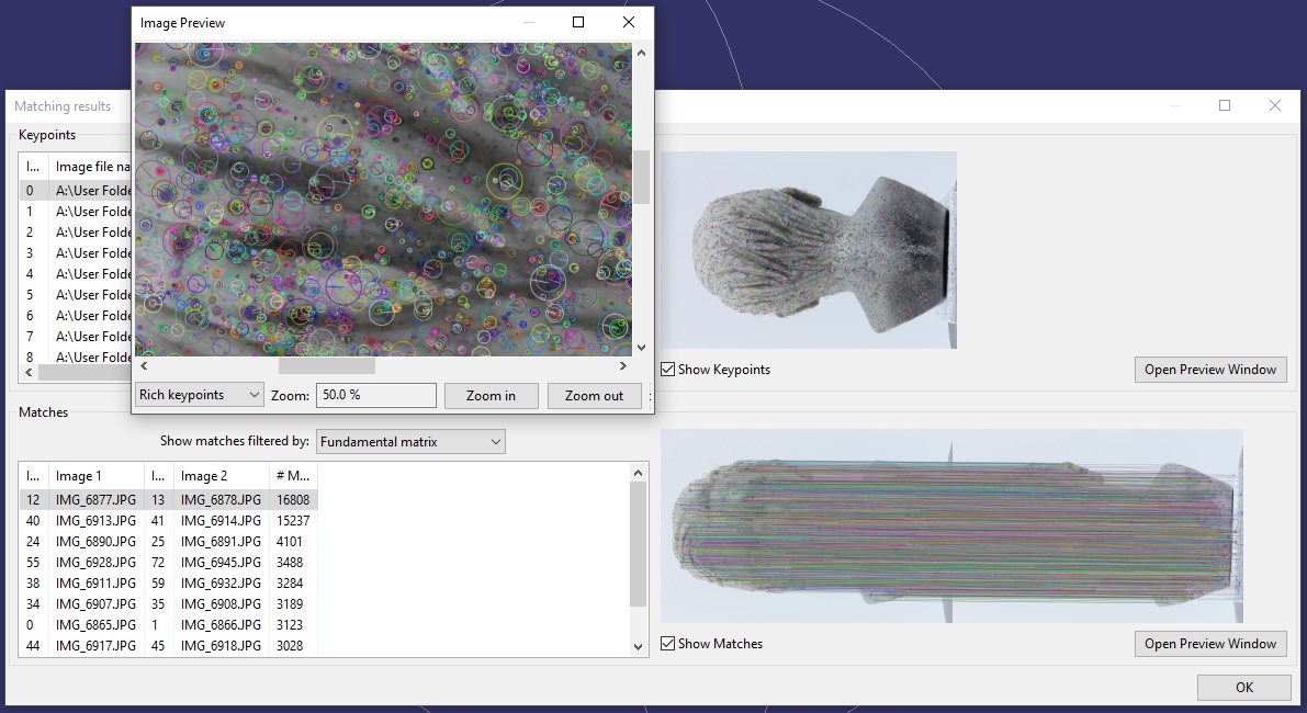
Are there enough matches?
If you click on your matches you should now see several options in the lower left:
If you click Show matching results... you'll get a dialog showing you the matches. At first you won't see anything different.
Check Show Keypoints to actually show the matches. Even then you might not quite see them. So to zoom in you can Open Preview Window and you should now be able to see a bunch of little circles around the ink splatters.
To see matches between pairs, in the lower half click Show Matches. It might take a second to load. And if you took your pictures right you should see just a bunch of lines, to the point you can't even see the images well.
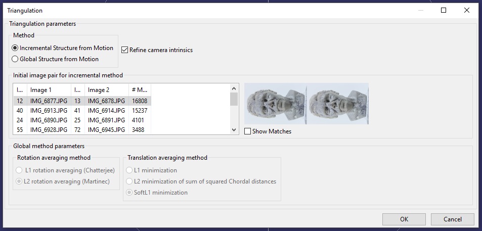
Triangulation
Next you're going to want to triangulate these matches. Basically in photogrammetry there's two point clouds you need to create, a sparse and a dense point cloud. This will create the first.
Click Triangulation.
There's two options here, Incremental Structure from Motion and Global Structure from Motion.
I could not get the first to work, it just crashes (EDIT: This no longer happens to me on my new computer and it works better sometimes).
So I use Global.
As to the other options, some match a few more cameras than others, but they didn't make much of a difference.
This shouldn't take that long to compute, just a few minutes.
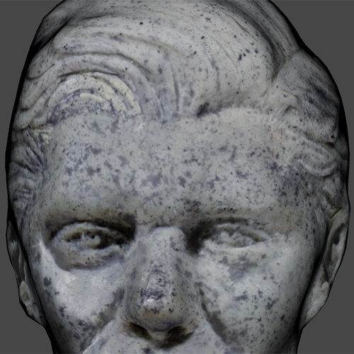
Finally you'll be able to see some points on the screen. If you load some other model and want to get back to this you can always just Show Triangulated Points.
You can also make the points bigger by moving the Point size slider in the top right. You should now be able to see a bunch of little green dots. Those are the cameras it captured. And in the lower left there's a field that tells you how many cameras were captured out of the total. Usually ~80/90% or more is enough.
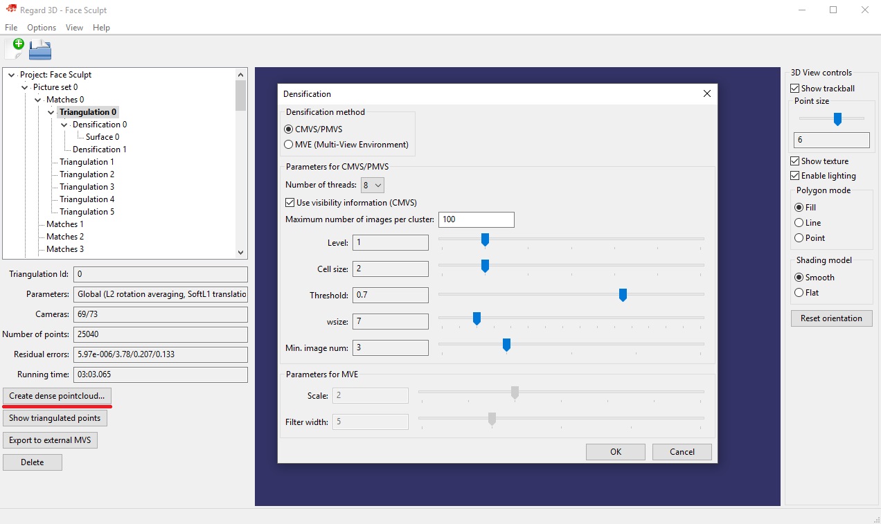
Densification
From your triangulation click Create dense pointcloud....
Here you basically have two options CMVS/PMVS and MVE.
CMVS/PMVS
Use visibility information : Uncheck this if you don't have that many images (~70 is not many) can produce better results because it will use more cameras.
Levels : This is like the resolution. With a lower number being a higher resolution.
Threshold : Increasing this can help reduce artifacts.
Cell size : Related to the resolution, works similar to Level.
Min. image num: If a point only appeared in 2 images but this is set to 3 it won't use it, so I suggest lowering this to 2 for the amount of photos I recommended.
Now I prefer MVE because I could not get Level 1 to work for me, only Level 2 and it looks worse than the defaults for MVE which do work for me.
This one does take a lot less time though (couple of minutes). And it seems to produce nicer point clouds with less artifacts but the end model did not look as nice as with MVE.
BUT you loose the option later to do a Floating Surface Reconstruction.
MVE
Scale: The resolution with a lower number being a higher resolution.
The problem with MVE is that anything but the defaults seems to create a lot of weird artifacts and nothing but the defaults seemed to work.
It also takes a lot longer (2-3h) Edit: On my new computer it's now 10-30min. If your computer isn't very powerful you might get out of memory errors. Try closing all your programs and just leaving it to run for a while or overnight, sometimes it will recover and finish.
But it does allow you do do Floating Surface Reconstructions later.
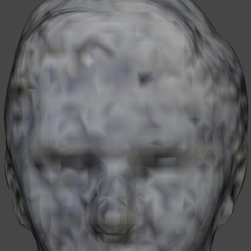
The Dense Point Cloud
The view might lag quite a bit at this point. You should see something that looks like your object with a few artifacts close to the surface depending on what method you chose. As long as there isn't a large cloud of them, you can still get good results.
For my case MVE at defaults turned out the better result.
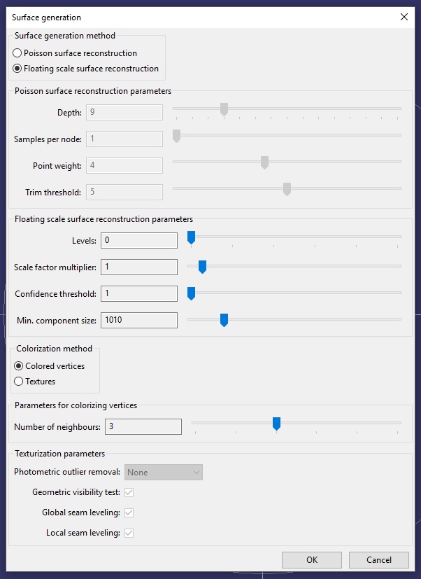
Creating the Surface
Click Create Surface.
We get the two options, one I already mentioned…
Floating Surface Reconstruction
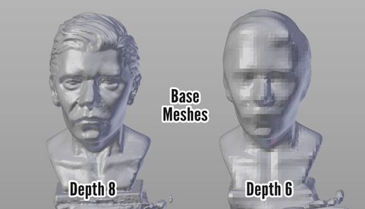
Levels: Like the resolution except now a higher value = more resolution.
This one can take ~1h sometimes for Level 0 which is the lowest so I was not able to try it out much and am not 100% confident as to what some of the other parameters do. I do know though that if you get blobs floating around the model, turning Confidence Threshold and Minimum Component Size up a bit will help get rid of those artifacts.
Possion Surface Reconstruction
PS: Sorry for the mispronunciation in the video, I literally read this as Poison.
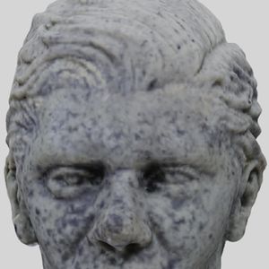
This is my preferred method.
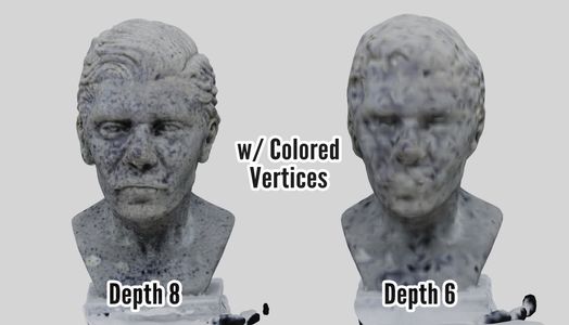
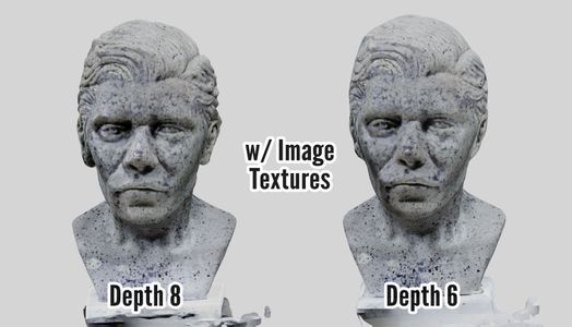
Depth: Like the resolution except now a higher value = more resolution. Don't go too high (9-10) or you'll get a lot of artifacts.
Samples per Node: Turning this up helps get rid of artifacts.
As for the other two settings, the defaults work well, turning them up just seems to make the base a bit neater.
Colorization
As part of the surface reconstruction textures are created.
There used to be a bug with the Textures option, the newest version has fixed it.
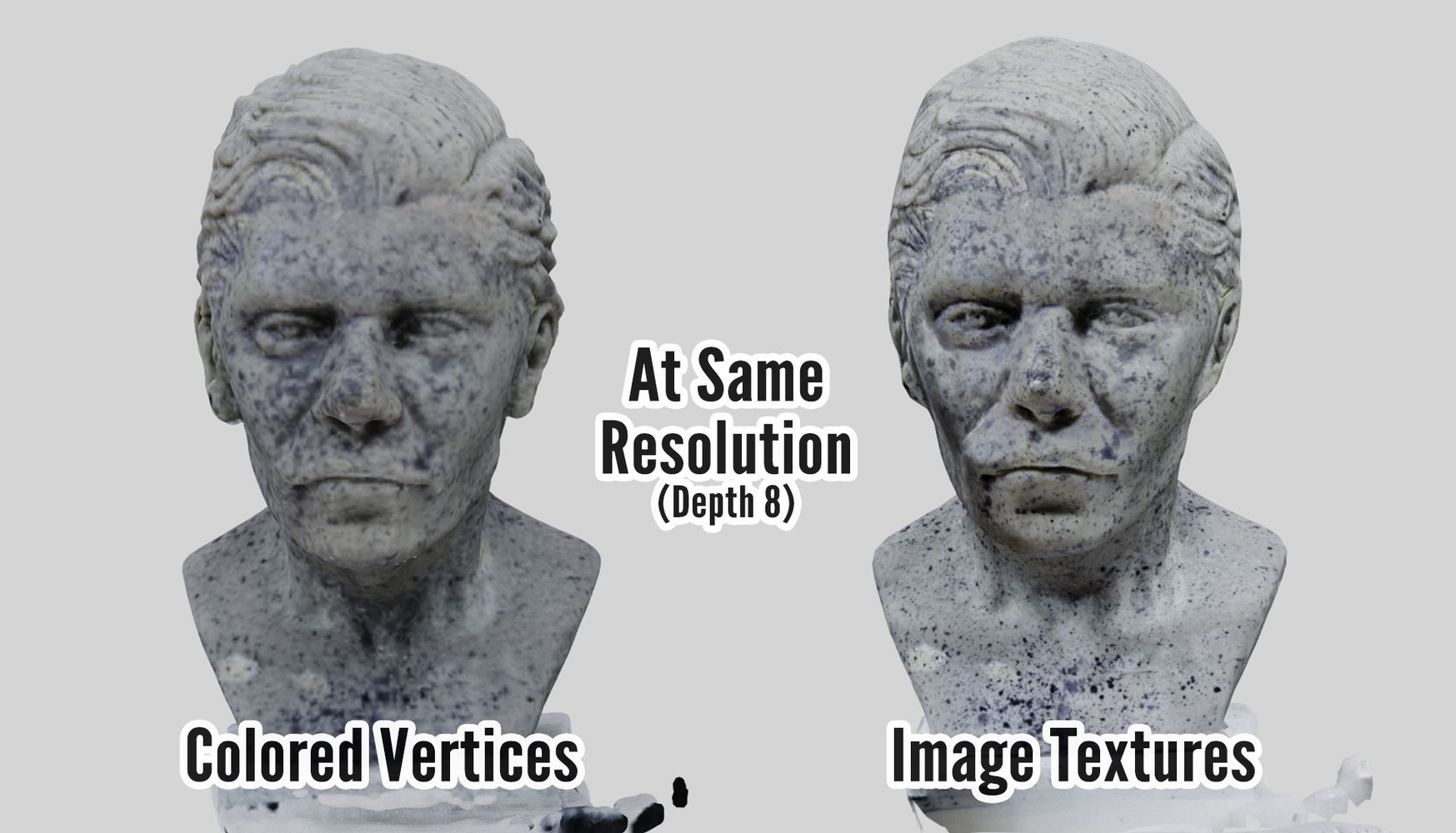
Textures are more detailed since it will produce image textures, while Colored Vertices depends on the resolution of the mesh but it also a bit faster.
Now the bug is fixed I do not recommend Colored Vertices unless you don't care about the textures at all. unfortunately you can't preview the surface without the textures if you used Colored Vertices so it kind of negates that instance too.
If you use Textures you can toggle them off in the sidebar to the right.
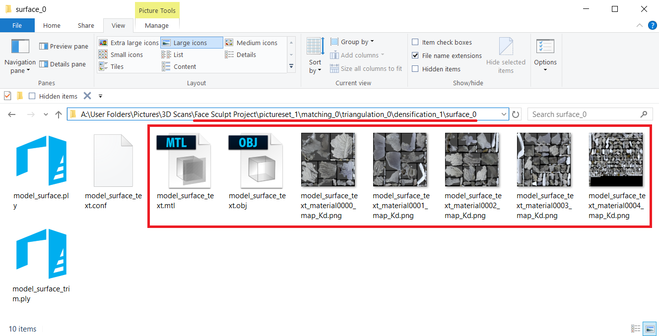
Exporting
From here we'll need to export our model for cleanup in other programs. You can use either Meshlab, it's free (you can also do the surface reconstruction of point clouds from there) but it's very hard to understand and the newest version does not work for me, or Blender.
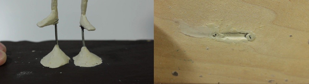
I could not record the cleanup because the mesh was so huge and freezing my computer, but at the end of the video I try to illustrate the basic steps I took with a simple sphere.
LINKS
Regard3D + Tutorial/Documentation
Meshlab (I was using 1.3.4BETA)
Blender
If your object is particularly small I recommend you look at this part of the tutorial I wrote on magic lantern (you don't need it to apply the concepts described but it's helpful if you have an DSLR camera).
PS: To give you an idea of the type how long it might take on your computer, or what type of computer you need, I'm using a laptop with an Intel i5, 8GB of RAM, and a NVIDIA 650M GPU.
Edit: And my new computer is a desktop with a Ryzen 1500x, 16GB of DDR4 RAM, and an NVIDIA 1050Ti so you can see why it no longer struggles.
]]>