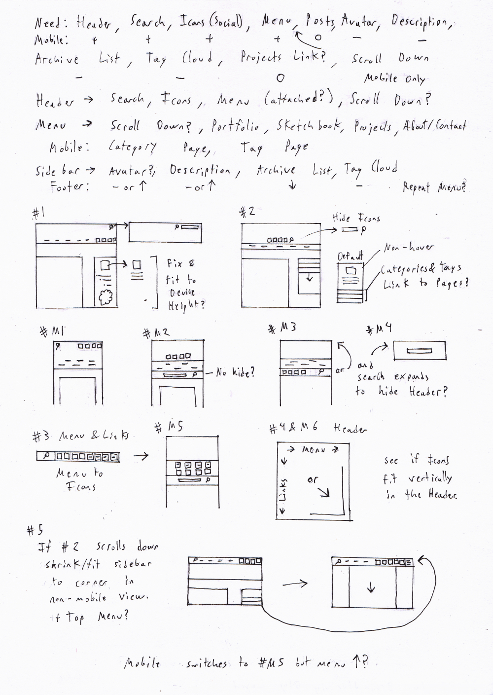
Final Site Design Brainstorm
Because the first brainstorm ended up not being used (design wise) I did another one. This time I put more thought into how the mobile side would function.
Sometimes as designers we’re tempted to include things in our designs that look nice or can be attractive on a desktop interface, but just slow down the site and make it annoying on mobile platforms.
So I only left stuff to the top that I felt was useful for users. You’re usually not going to try to go through a blog’s archive tree from mobile for example. But at the same time it’s not completely inaccessible (there’s a link to the page). I think decreased functionality is just as bad as interfering functionality. By interfering functionality I mean things like the following. These are just things that annoy me as a user. Yes most phones are getting bigger screens but some of us are still stuck with 3.5 inch screens.
Fixed Search/Menu Header - They are really annoying on screens smaller than 3.5 inches (original iPhone size).
Popups - Don’t, just no, don’t do it.
Lightboxes - I have mixed opinions about these. If they’re super fast they’re great, but otherwise they suck. It’s a fine line. I ended up using inline thumbnails and pictures with easy links to the full image.
Un-hoverable Menus - Make sure if you have menus they “hover” when tapped once on mobile devices instead of going straight to the link or appearing then disappearing.
Infinite Scrolling - I would strongly advice against it. 90% of sites with infinite scrolling still crash my iPod Touch (4th gen). Even on a desktop this is a bad idea if users are likely to scroll past the 3rd-4th page (who doesn’t want their users to read a lot?). Each page that you load is added to the memory and therefore slows down the site. There will be a point at which it becomes sluggish on almost any device. The only way you might get away with infinite scrolling is if you only have text.
No Next/Previous Gestures - I don’t know who thought this was a good idea, but some blogs allow you to “turn” to the next post. But all that happens is that you accidently turn a page when you don’t want to.
Anything that messes with the font size when rotating the device.