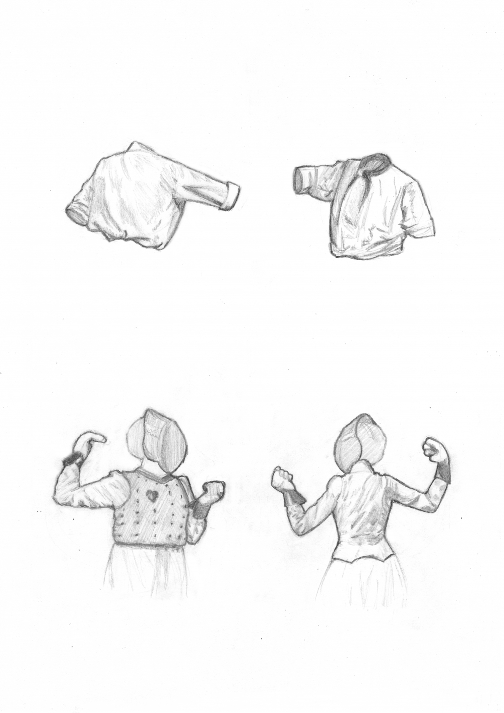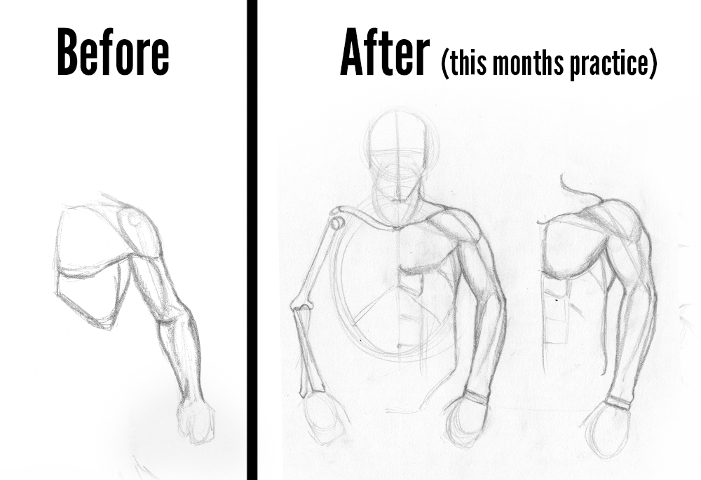
Comparison of my arms before and after this month's practice.
Before was with ref, after was done without.
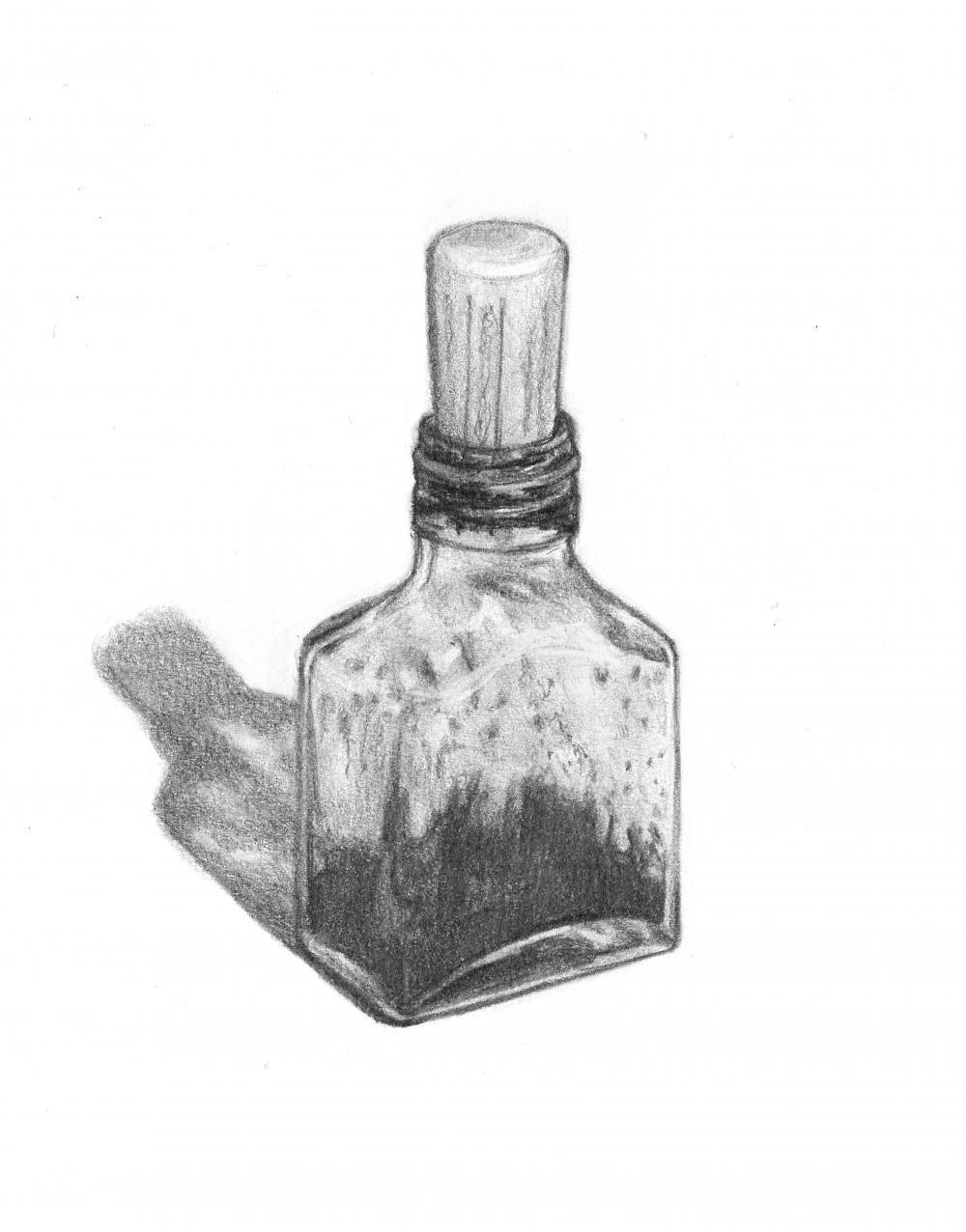
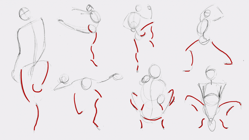
September's Daily Sketches
In this video I go through all the sketches I did this month and some new methods I used to practice.
If you have a tablet and are interested in trying 3d sculpting, I would suggest Sculptris which is free and very easy to use (also look out for Zbrush Core which is supposed to be an easier affordable version of Zbrush, all 3 are from the same company, Pixologic). Just note it's not meant for point modeling (that is for very geometric shapes like the rib cage). It's more like sculpting with clay, for point modeling you need something like Blender but it has a huge frustrating learning curve.