image/svg+xml

Paintings, sketches, tutorials, videos, and art related DIY projects.
Thumbnail for Drawing Some Hands

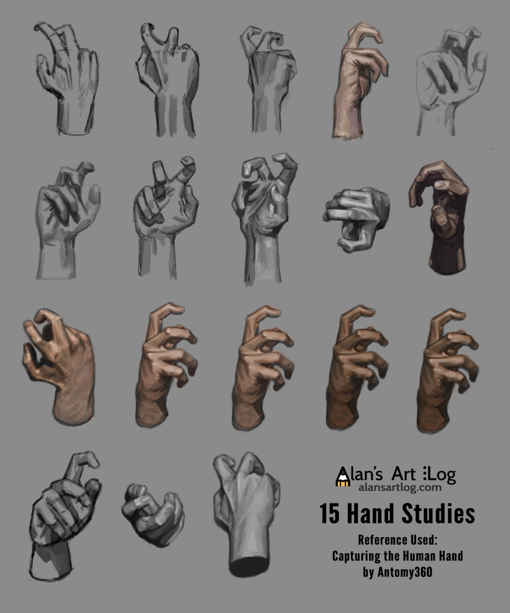
Drawing Some Hands

I’m trying out something slightly different. I want to do more video but the editing always takes so long I avoid it. So I’m thinking of doing videos like this one, possibly even more concentrated (one hand at a time) because it’s so much easier to edit. Then maybe once I get the hang of it (and a proper mic - 50% of is getting the iPhone audio bits in sync) I’ll start making longer ones. Anyways enjoy.

Patreon Only Full Size PSD

New Years Resolutions?

I’ve never done new year’s resolutions. I find them a bit silly in general because no one really goes through with them, and then personally I would find it depressing having to set goals at some arbitrary time every year that I might not be able to accomplish (and it won’t be for lack of trying). Not that I think setting goals is bad idea, in fact, I think it’s a really good idea, but not like this. I have to want or need them.

Read More…

Thumbnail for Final Site Design Brainstorm

Final Site Design Brainstorm

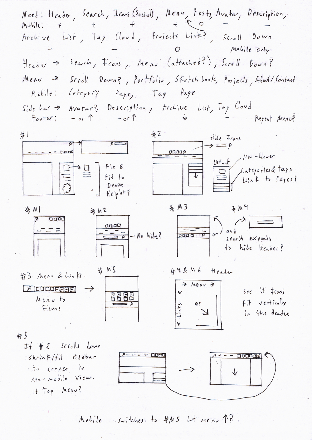
Because the first brainstorm ended up not being used (design wise) I did another one. This time I put more thought into how the mobile side would function.

Sometimes as designers we’re tempted to include things in our designs that look nice or can be attractive on a desktop interface, but just slow down the site and make it annoying on mobile platforms.

So I only left stuff to the top that I felt was useful for users. You’re usually not going to try to go through a blog’s archive tree from mobile for example. But at the same time it’s not completely inaccessible (there’s a link to the page). I think decreased functionality is just as bad as interfering functionality. By interfering functionality I mean things like the following. These are just things that annoy me as a user. Yes most phones are getting bigger screens but some of us are still stuck with 3.5 inch screens.

  • Fixed Search/Menu Header - They are really annoying on screens smaller than 3.5 inches (original iPhone size).

  • Popups - Don’t, just no, don’t do it.

  • Lightboxes - I have mixed opinions about these. If they’re super fast they’re great, but otherwise they suck. It’s a fine line. I ended up using inline thumbnails and pictures with easy links to the full image.

  • Un-hoverable Menus - Make sure if you have menus they “hover” when tapped once on mobile devices instead of going straight to the link or appearing then disappearing.

  • Infinite Scrolling - I would strongly advice against it. 90% of sites with infinite scrolling still crash my iPod Touch (4th gen). Even on a desktop this is a bad idea if users are likely to scroll past the 3rd-4th page (who doesn’t want their users to read a lot?). Each page that you load is added to the memory and therefore slows down the site. There will be a point at which it becomes sluggish on almost any device. The only way you might get away with infinite scrolling is if you only have text.

  • No Next/Previous Gestures - I don’t know who thought this was a good idea, but some blogs allow you to “turn” to the next post. But all that happens is that you accidently turn a page when you don’t want to.

  • Anything that messes with the font size when rotating the device.

Thumbnail for Two Fencing Sketches

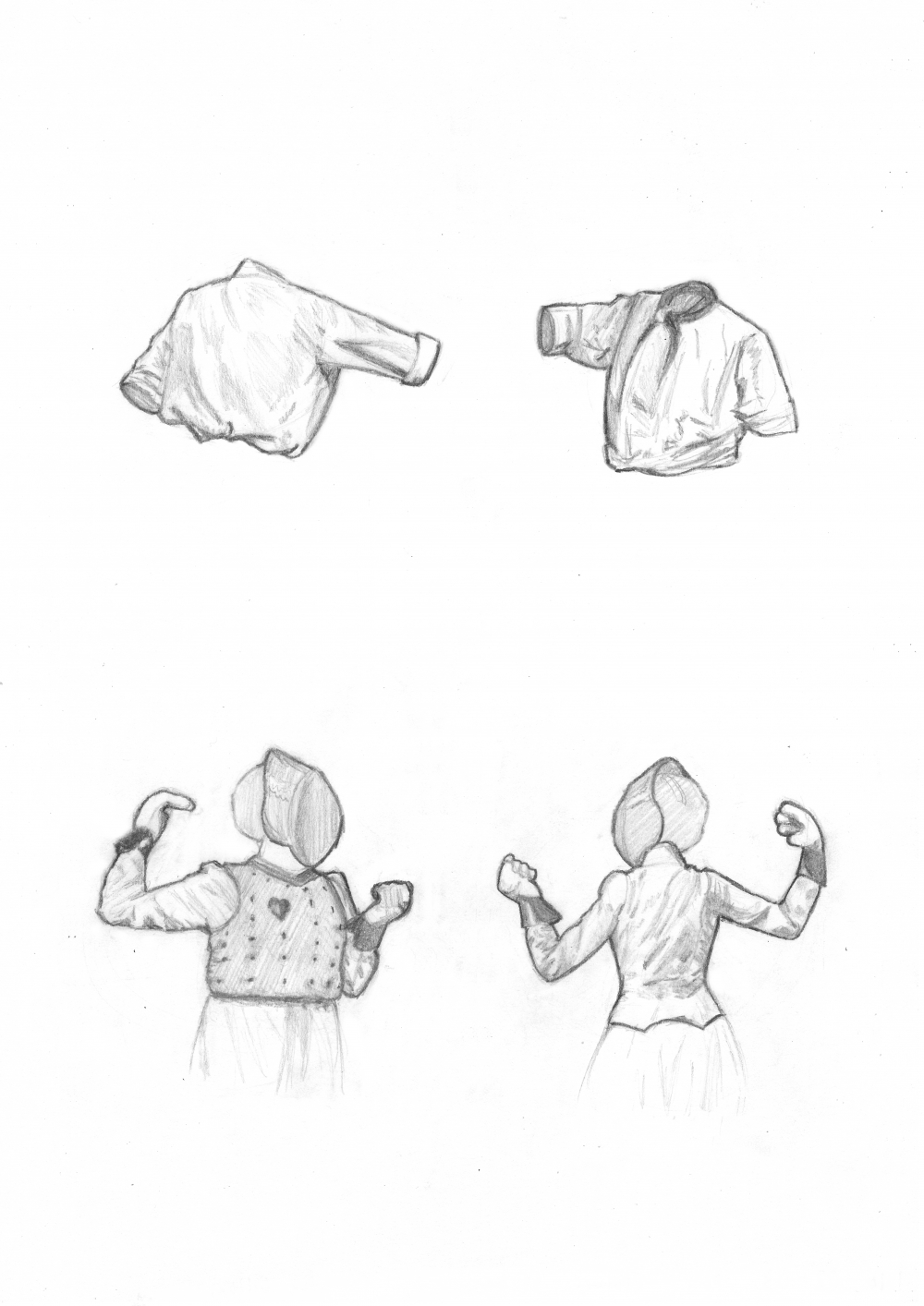
Sketches of:

Scene of two men fencing

and

Two women fencing

Two Fencing Sketches

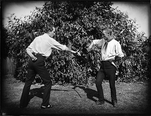
Flickr has a large collection of photos from museums and such that are out of copyright or with no known copyright restrictions. You could go to the individual museums but it’s much easier to search them through Flickr. Anyways, I will occasionally search such images. They’re usually old and rather boring but occasionally there will be some interesting ones like the two above.

I had actually planned on sketching the faces and everything as well with the first sketch, but I had started with the shirts, finished those first, and I just loved how they looked without hands/faces so I left them like that. Both sketches were also drawn with the figures closer than they actually were which I think gives them a strange dynamic. I like how it ended up so much I’m thinking of doing a painting in a similar style.

Here’s the original image for comparison:

Two People Fencing

The second one is more similar to the original because I wasn’t quite sure where to stop. I didn’t draw their faces, but everything else was covered and therefore you don’t get the same effect from just drawing the clothing / inanimate objects.

Thumbnail for First Sketch from a Course in Pencil Sketching

Course in Pencil Sketching - Exercise

First Sketch from a Course in Pencil Sketching

A sketch from the book I mentioned two posts ago, Course in Pencil Sketching by Ernest Watson.

The sketches are all from the same image for the first exercise. I was experimenting with different techniques.

Thumbnail for Logo Brainstorming

Logo Brainstorming

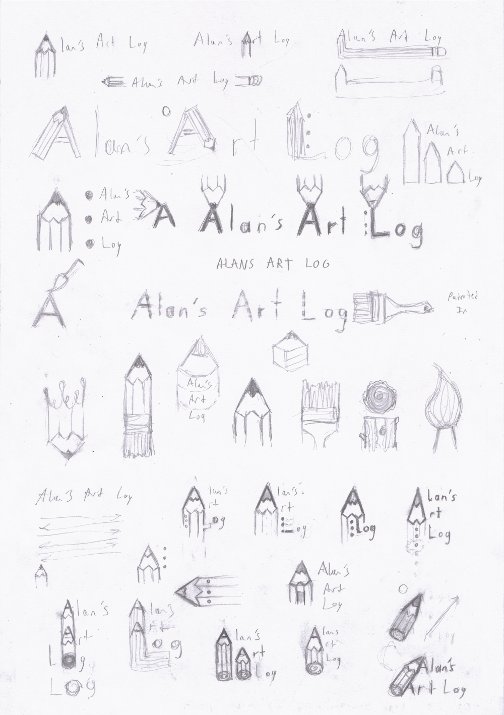
The many ideas I played around with before settling for the current logo.

Thumbnail for First Site Design Brainstorm

First Site Design Brainstorm

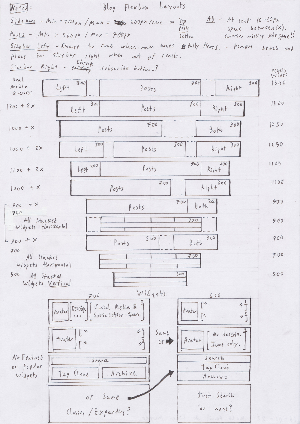
These ended up being unused for the most part because I forgot flexboxes couldn't really do some of the things I was expecting from them with a double column layout.

Still, the pre-planned media queries came in handy for the two columns.

Thumbnail for Modifying IKEA Andy Drawers

Modifying IKEA Andy Drawers

You can also find this post as an instructable.

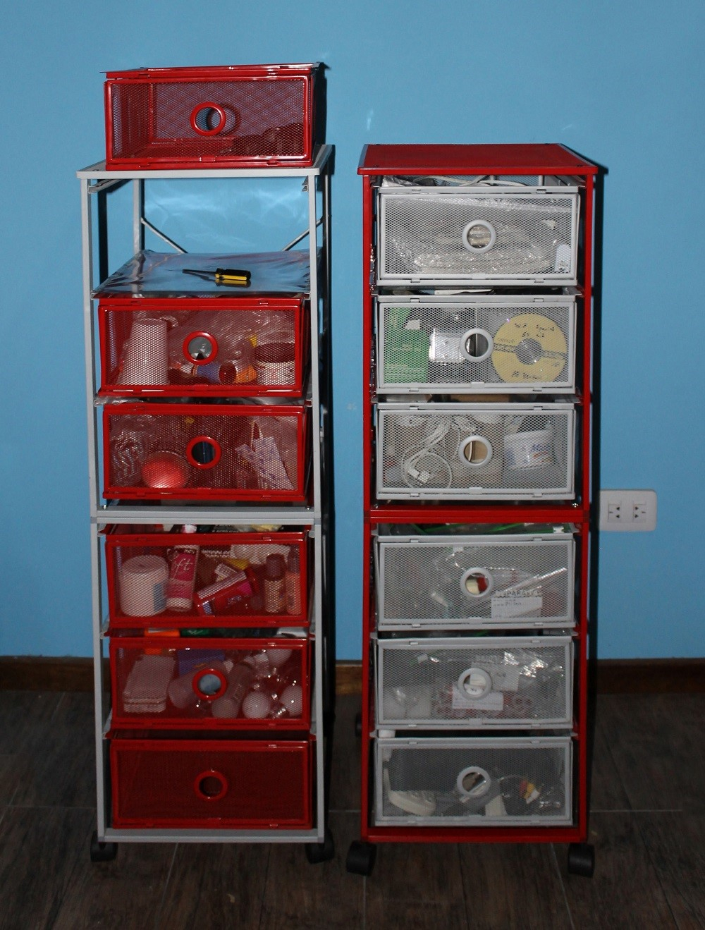
I’ve had four Andy Drawers (two red, two grey) for years. They’re great. I really like them because they’re really light and portable but at the same time they do have some problems. The first is the dust. This wasn’t so bad before but now I live somewhere really dusty and I had to stop storing any sort of paper in them because they’d get all gross. The second is that if you happened to get the ones with a matte finish (grey), the drawers don’t slide nearly as nicely as with the glossy ones.

Lastly, only two really fit under my desk, I can’t see anything when I go search for something, I bump into them with my chair all the time, and the other two are always in the way when I don’t need them, and too far when I do. So apart from fixing the first two problems I’ve also decided to put them one on top of the other both to save space and fix the light problem.

Read More…

Thumbnail for Color Swatches

Color Swatches

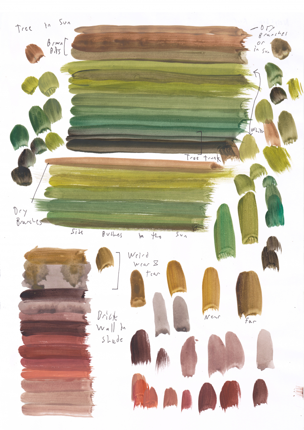
Brick wall & tree.

Color Swatches

I’ve heard of artists keeping a notebook with just random color swatches as an exercise in observing color and I found that interesting. Also like I mentioned this is one of the things I most enjoy about painting, matching the colors. So I gave it a try.

I used quality printer paper which is quite fine for pencil sketches but it doesn’t take paint well so I’ll probably be making a tiny watercolor notebook just for this in the future because I really enjoyed it.

Thumbnail for Two Landscapes

Sketches of:

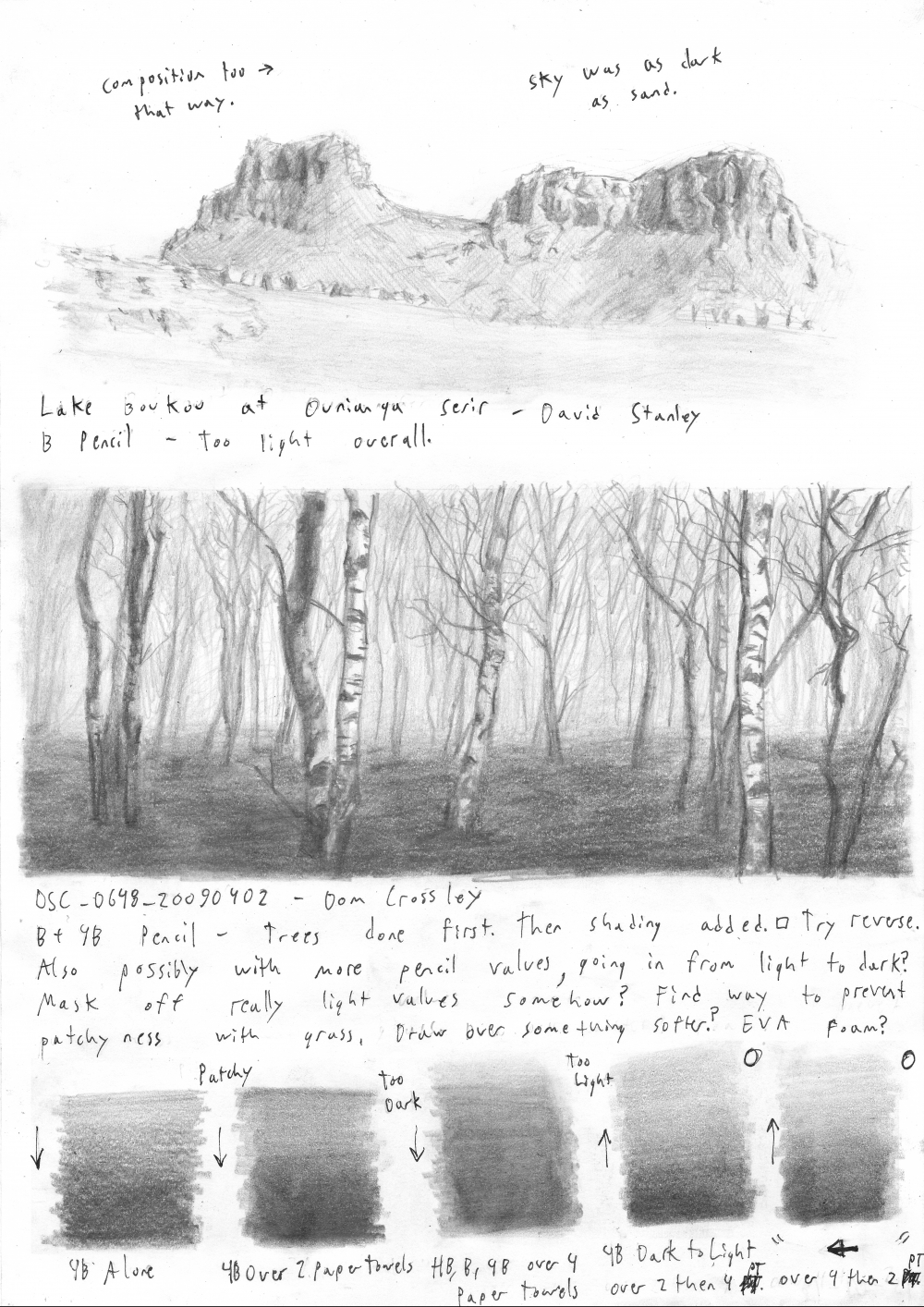
Lake Boukou at Ounianga Serir by David Stanley/ used under CC-BY

and

DSC064820090402 by Dom Crossley / used under CC-BY

Two Landscapes

Okay, sketches from now on have accurate dates. Before I only used the month or the date I edited them. Still, I’ve changed the post date so that they don’t sink below the sketchdump.

Anyways, as you can see I’ve made more notes. I’m trying to keep all my sketches clean and presentable like I talked about in my resolutions post.

Now I struggled a bit with the dark shading in the tree sketch and I want to mention this because it just so happened I had started to read a Course in Pencil Sketching by Ernest Watson, and it mentioned something interesting that I’d never considered and that is the surface on which you’re drawing and whether it’s hard/soft. I would usually draw on a hard surface because you can get more precise lines, but as the book explains this is a horrible surface for shading.

So those blocks of shading at the bottom are me experimenting with different surfaces and pencil combinations. My favorite where the last two. I used a 4B (Lyra) pencil and did two passes over two surfaces (4 & 2 paper towels thick). The order didn’t seem to matter. I’m not going to do that for all sketches, but it’s something to keep in mind for large areas of black like the grass. For general sketches I’ve moved over to drawing over a plastic folder filled with paper (where I keep my sketches).

I still have to try those notes/to-do’s I left myself.